Kosmonel
A clean, contemporary identity for a cybersecurity company with its own point of view.

01 — Context
Kosmonel wanted a modern, sleek presence that would help it stand apart from generic cybersecurity brands. I developed the complete brand identity, connecting a distinctive symbol, a focused palette and a consistent visual language across the project.
02 — Objective
Communicate technical confidence through a clear, recognisable identity that feels current and distinctive across corporate materials and brand applications.
03 — Approach
The identity centres on a star enclosed by an orbit. Its simple geometry gives Kosmonel a recognisable symbol, while the outline treatment provides a second expression of the same form. Signature blue carries through the palette and application layouts.
05 — Outcome
Design Output
A complete identity built around a consistent symbol and visual language, with application studies showing how it can extend across stationery, signage and merchandise.
Scope of Work
Key Deliverables
- Complete Brand Identity
- Logo & Symbol System
- Brand Colour Palette
- Brand Guidelines
- Stationery & Application Design
Visual Documentation

The central star and enclosing orbit form Kosmonel's primary mark.

The same symbol in outline on a blue background.
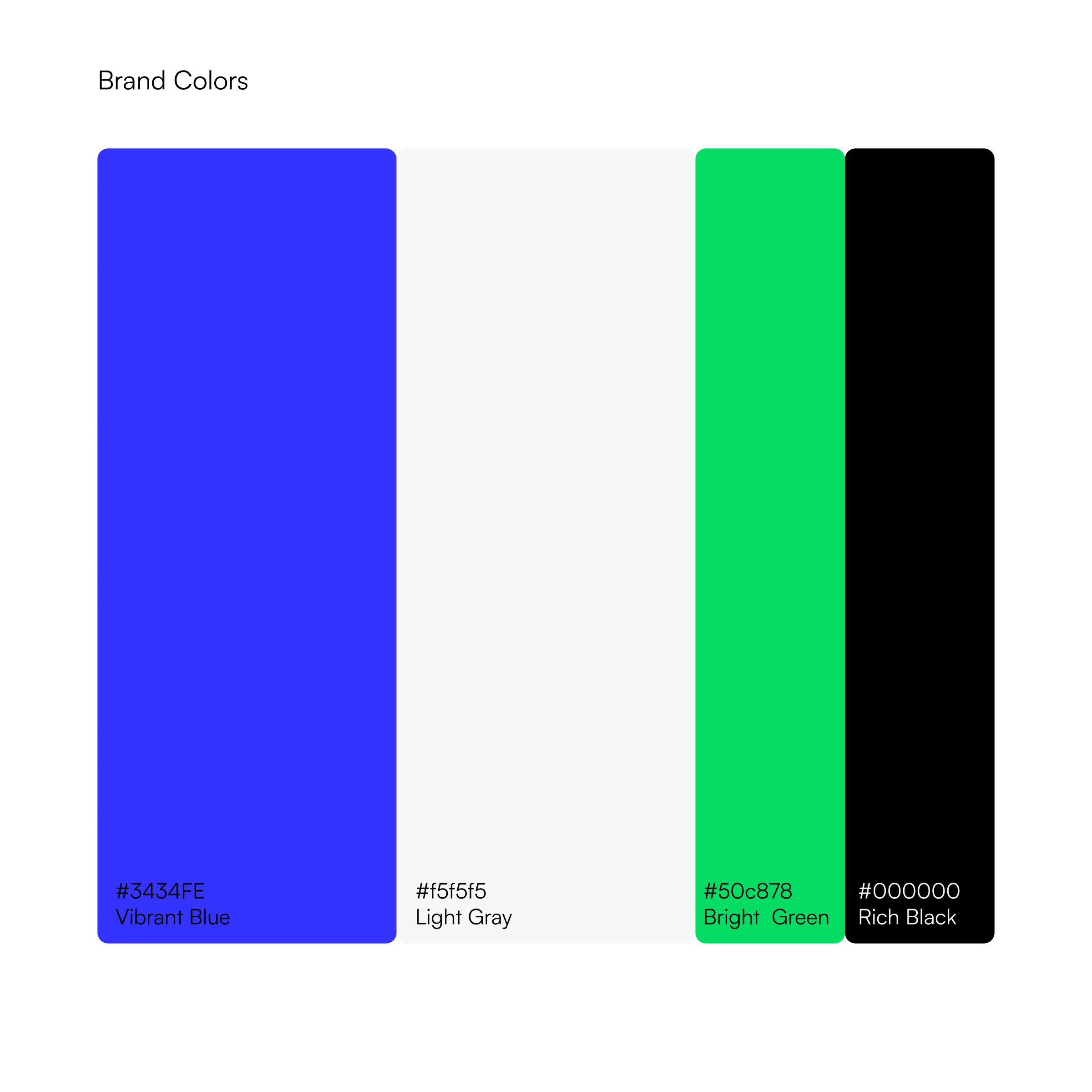
Blue, light grey, green and black define the published palette.
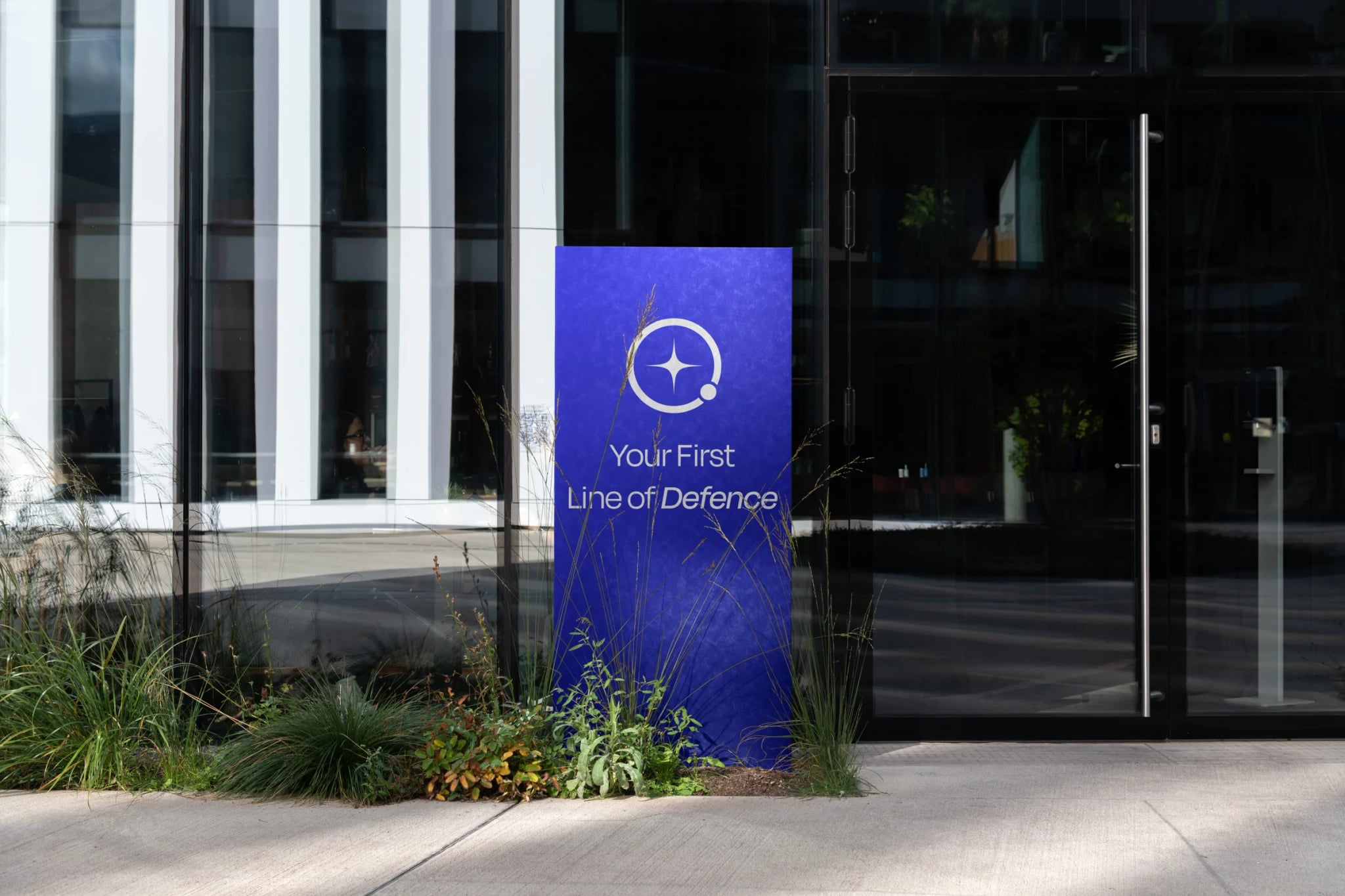
An environmental application mockup exploring the identity at a larger scale.
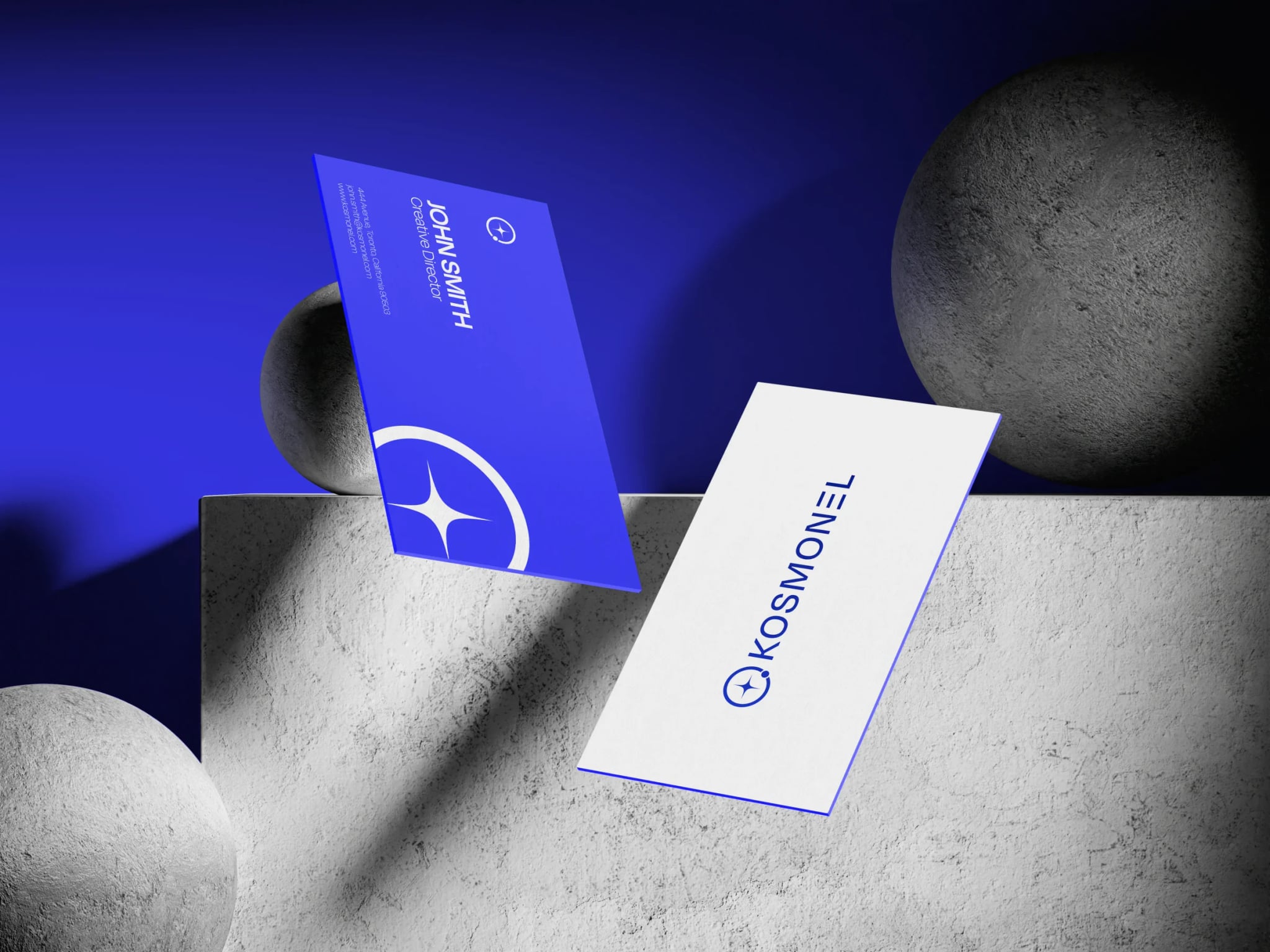
A business-card mockup carrying the symbol, wordmark and blue palette.
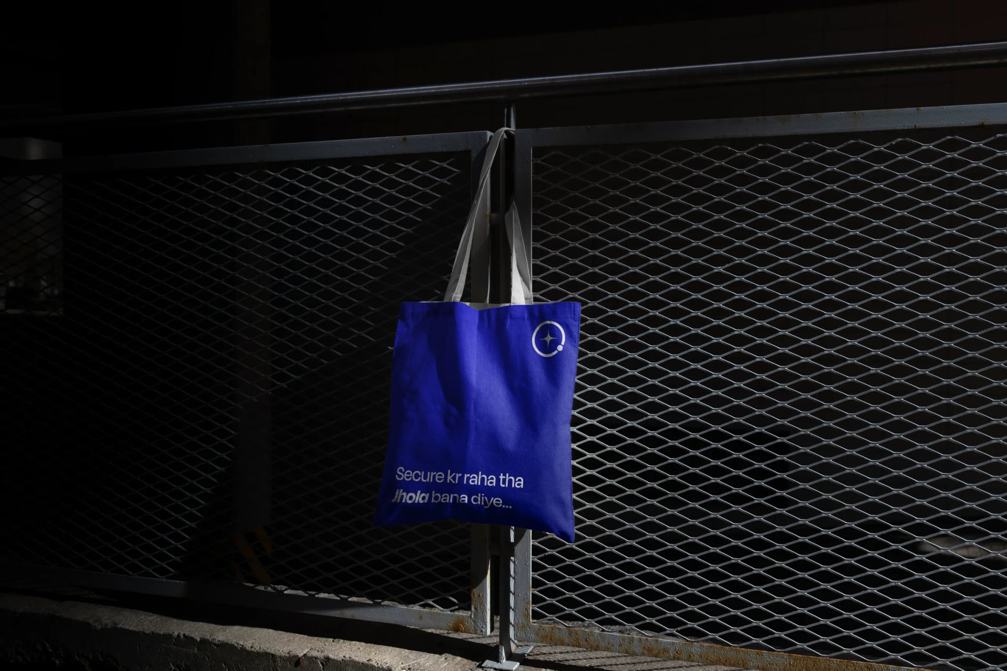
A tote-bag mockup extending the identity into a physical touchpoint.
Ares & Co.
A self-initiated identity study exploring object-level luxury, editorial restraint and a more architectural approach to jewellery branding.