Ares & Co.
A self-initiated luxury identity study exploring material authority, editorial restraint and object-level desirability.
Note: Ares & Co. is an independent concept project created to explore a more architectural visual language for contemporary jewellery.
01 — Context
Ares & Co. is an independent concept project created to explore a more architectural visual language for contemporary jewellery. The exploration investigated how jewellery brands can step away from fragile conventions toward grounded, sculptural authority.
02 — Objective
Demonstrate how a disciplined visual language emphasizing weight, material purity, and editorial pacing can elevate luxury perception.
03 — Approach
Structured around physical weight, interlocking AC monogram geometry, documentary art direction rules, and rich oxblood and gold packaging.
05 — Design Intent
Design Intent & Exploration
Demonstrates how typographic restraint, architectural layout systems, and material-focused art direction can establish an unmistakable luxury presence.
Scope of Work
Key Deliverables
- Concept Identity System
- Monogram & Geometric Grid
- Art Direction & Photography Rules
- Packaging & Collateral System
- Social Media Framework
Visual Documentation
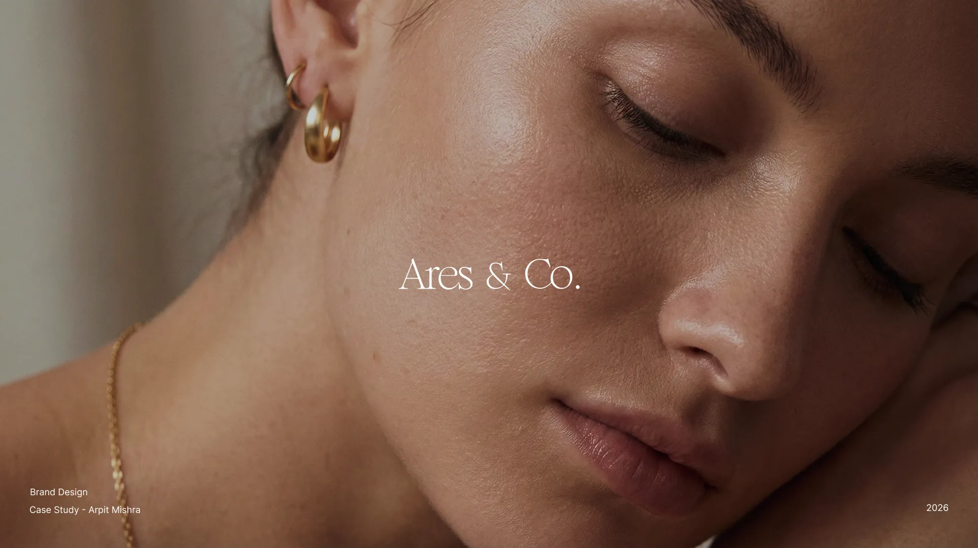
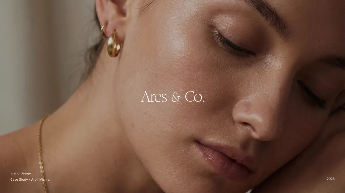
Identity case study title presentation featuring sculptural gold jewellery.
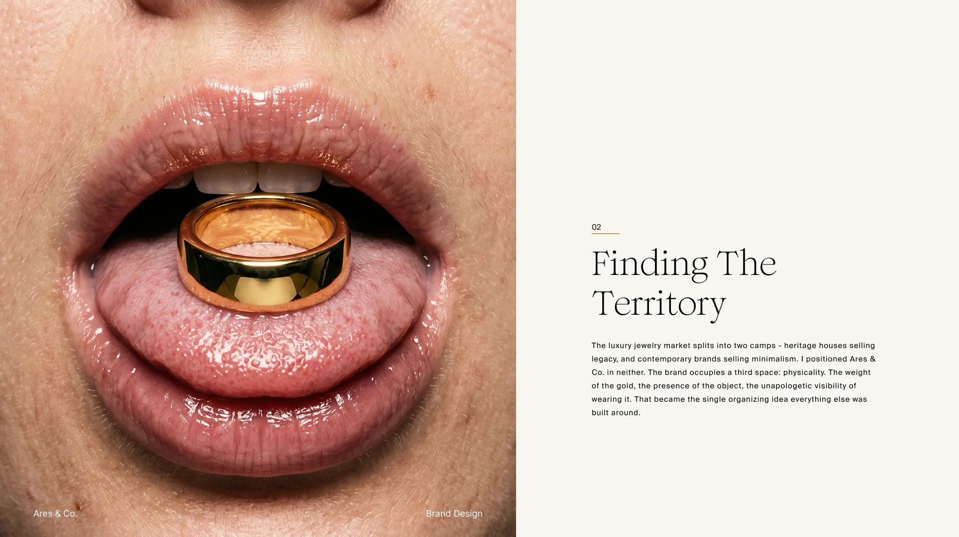
Market positioning: "The brand occupies a third space: physicality. The weight of the gold, the presence of the object."
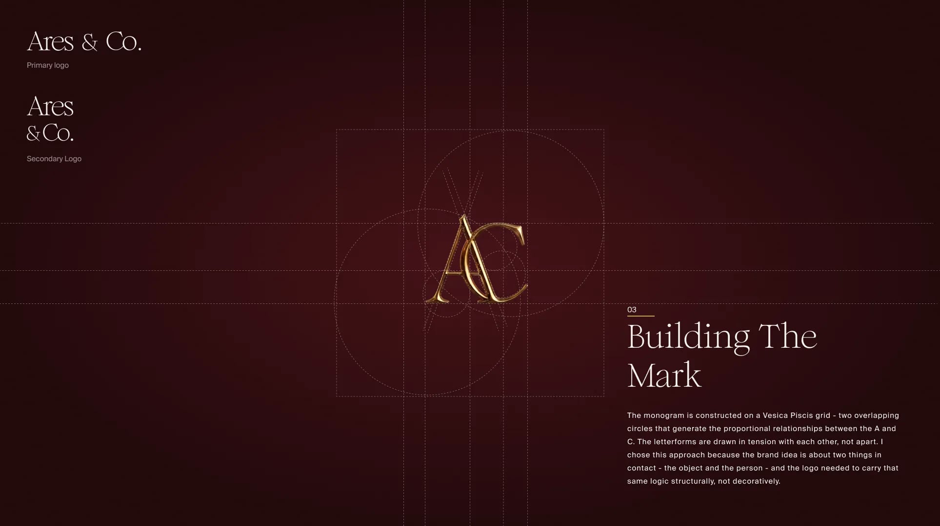
Interlocking AC monogram constructed on a Vesica Piscis geometric grid.
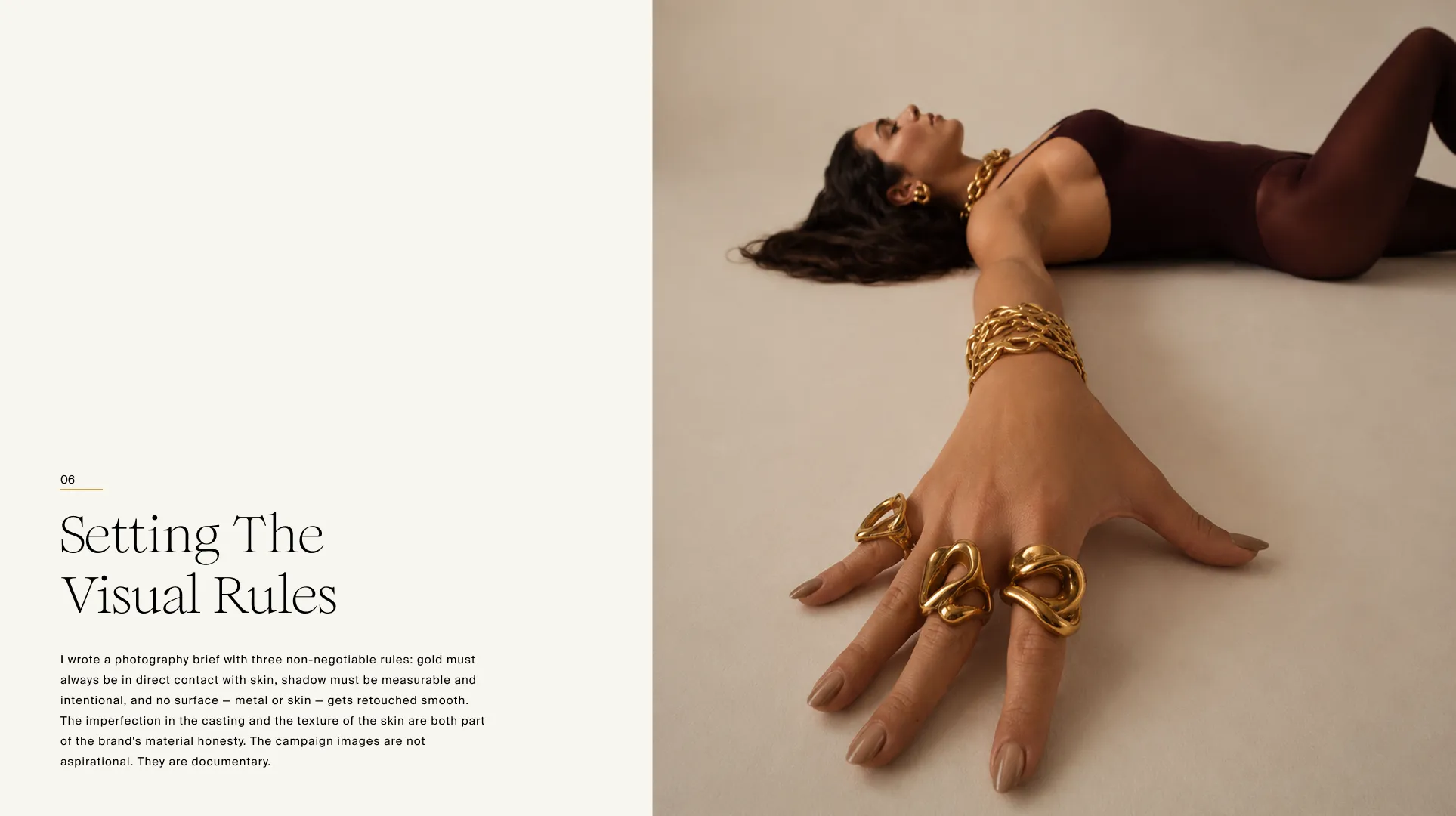
Documentary art direction rules: gold in direct contact with skin, intentional shadows, and unretouched textures.
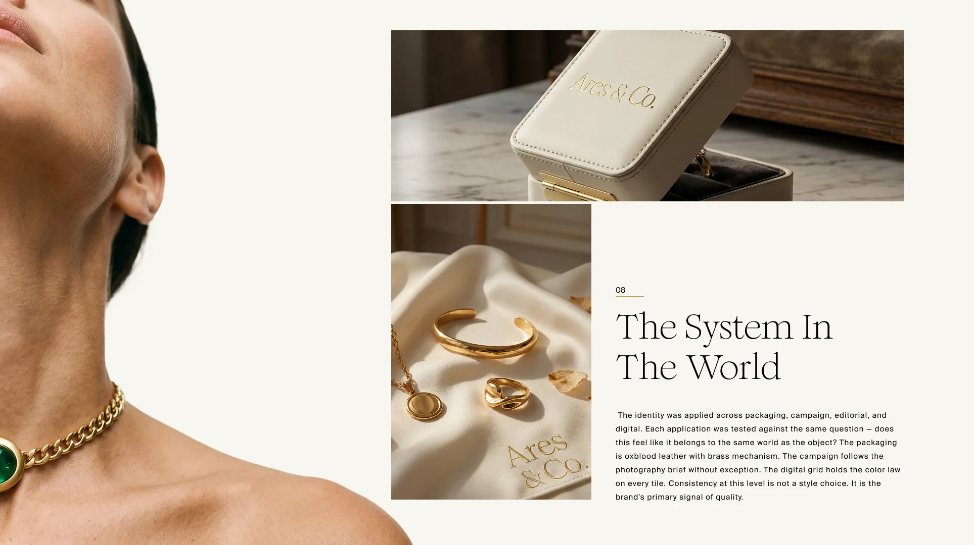
Packaging application in oxblood leather with brass mechanisms, silk pouches, and gold foil stamping.
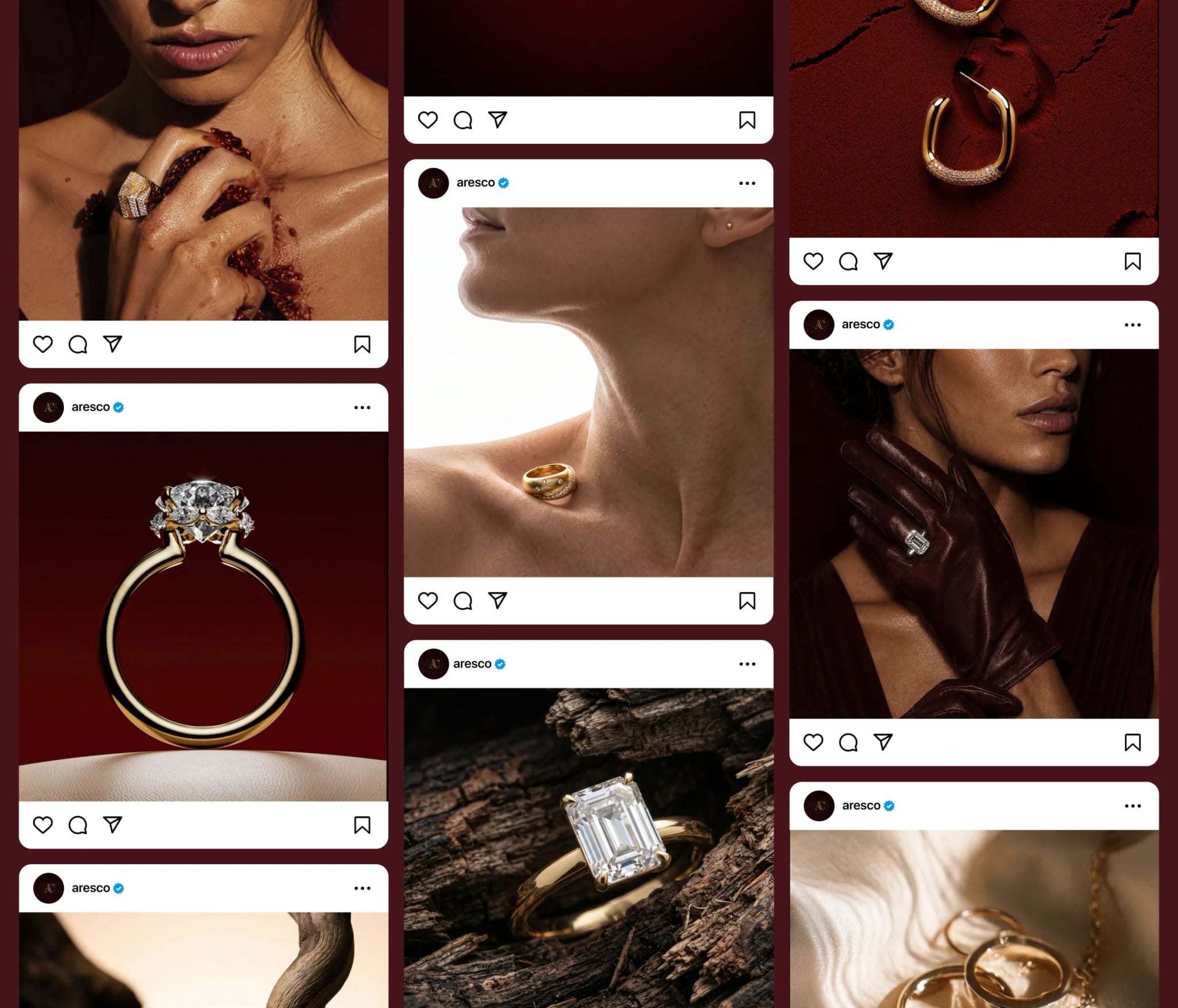
Curated social media gallery rhythm for @aresco.
BrewZen
A self-initiated beverage brand concept built around ritual, origin and a warm visual system designed to feel considered rather than commercial.