BrewZen
A self-initiated beverage identity exploring ritual, origin and quiet premium positioning.
Note: BrewZen is an independent concept project exploring how a specialty beverage brand could move away from conventional aesthetics toward something calmer and more ritual-led.
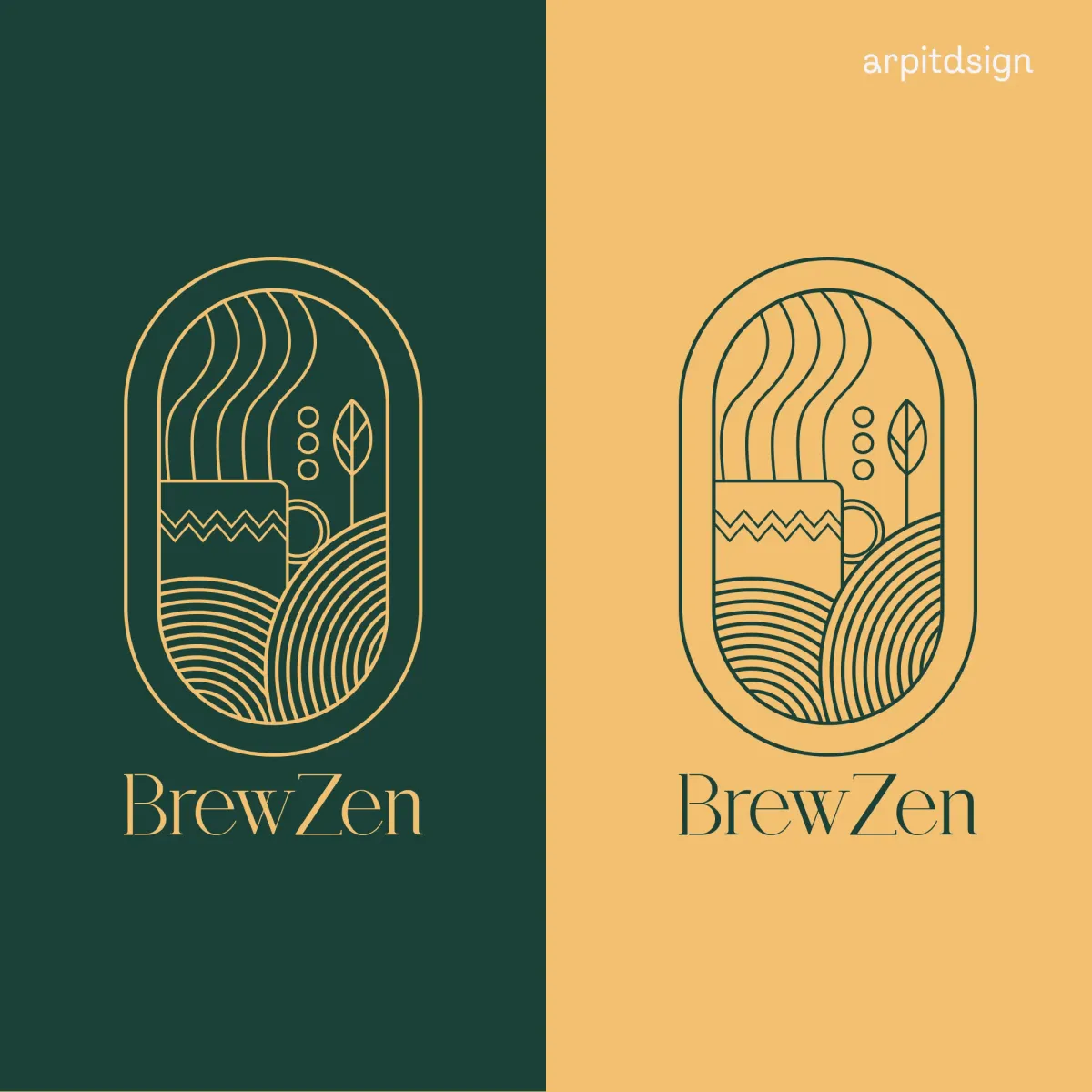
01 — Context
BrewZen is an independent concept project exploring how a specialty beverage brand could move away from noisy commercial aesthetics toward mindful brewing rituals.
02 — Objective
Design a packaging and brand identity architecture rooted in visual tranquility, tactile textures, and heritage storytelling.
03 — Approach
Combined line-art illustrations (steaming cup, botanical leaf, tea garden rows), tranquil green and soothing beige hues, and elegant typography.
05 — Design Intent
Design Intent & Exploration
Demonstrates how quiet, ritual-focused branding and tactile packaging can create genuine differentiation in consumer beverage categories.
Scope of Work
Key Deliverables
- Visual Identity System
- Illustrated Emblem & Wordmark
- Brand Story Guidelines
- Colour Palette Specifications
- Typography (Glycerints & Satoshi)
- Drinkware & Packaging Mockups
Visual Documentation
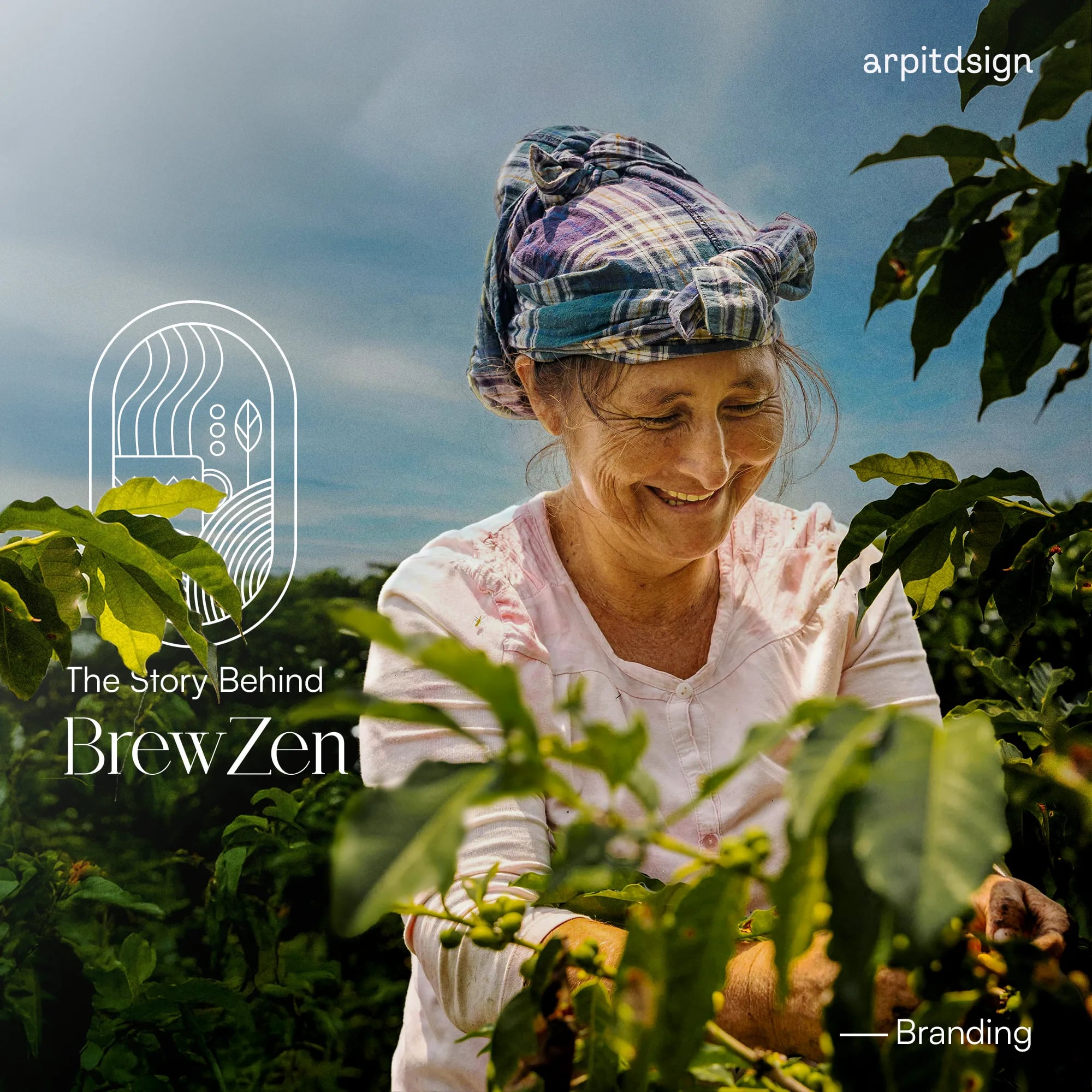
Brand cover featuring agricultural origin, tea plantation, and illustrated emblem.
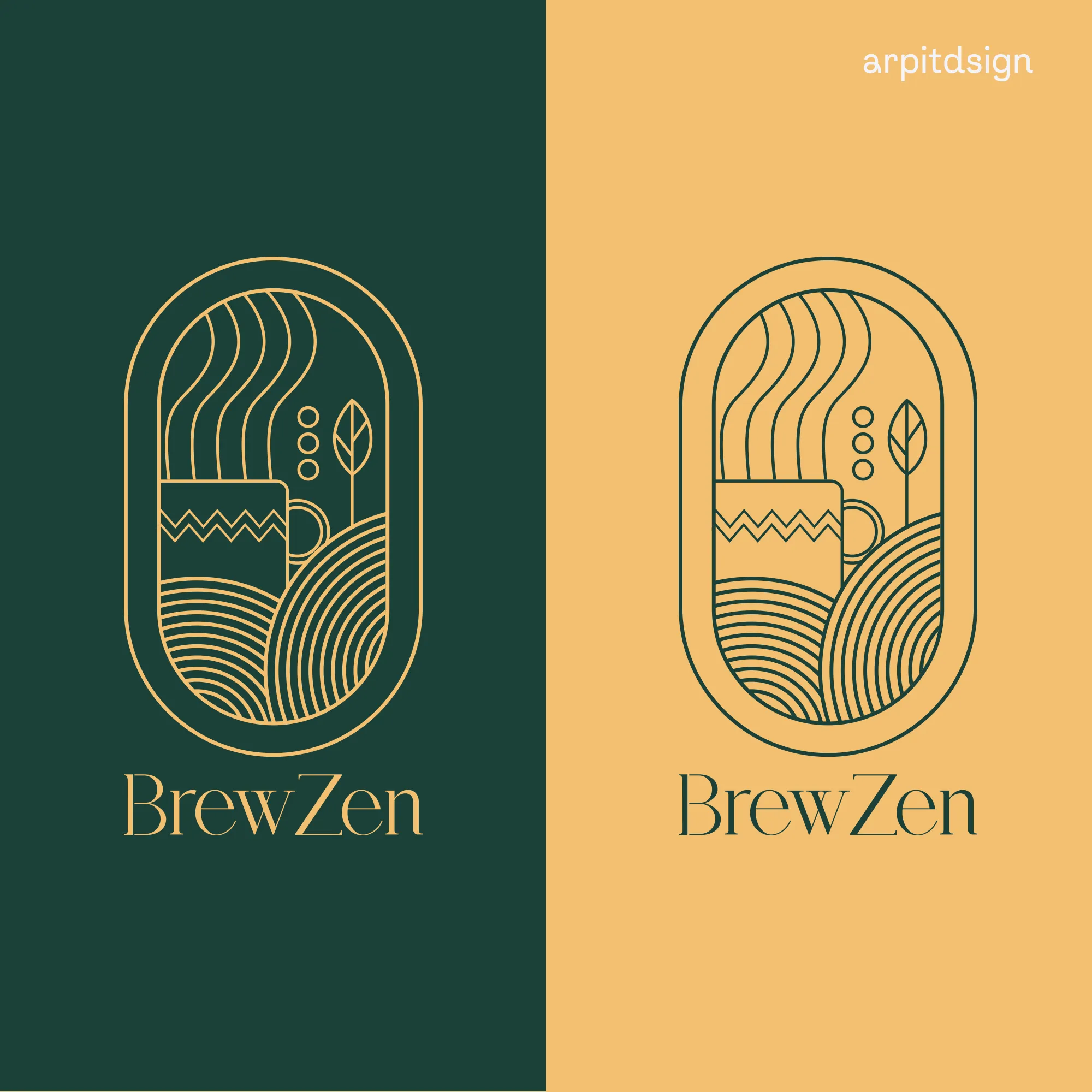
Illustrated badge combining steaming cup, botanical leaf, and tea terrace rows in green and warm ochre.
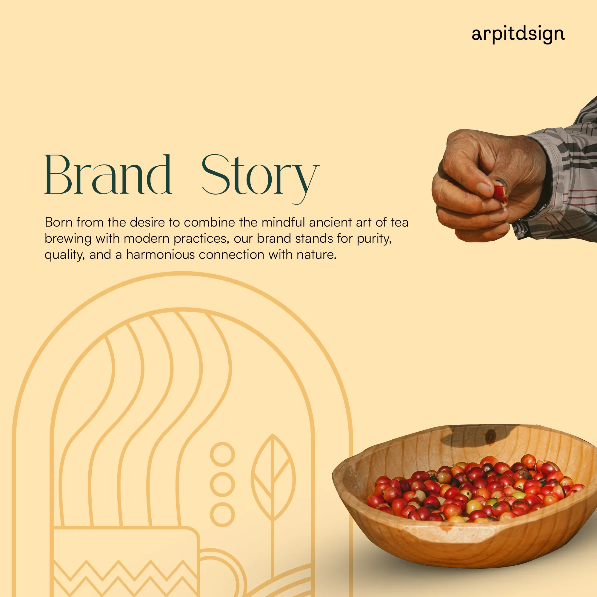
"Born from the desire to combine the mindful ancient art of tea brewing with modern practices..."
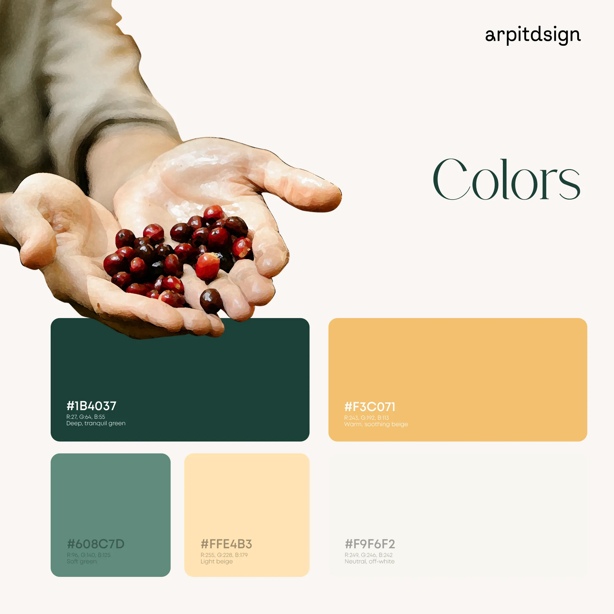
Deep Tranquil Green (#1B4037), Warm Soothing Beige (#F3C071), Soft Green (#608C7D), and Light Beige (#FFE4B3).
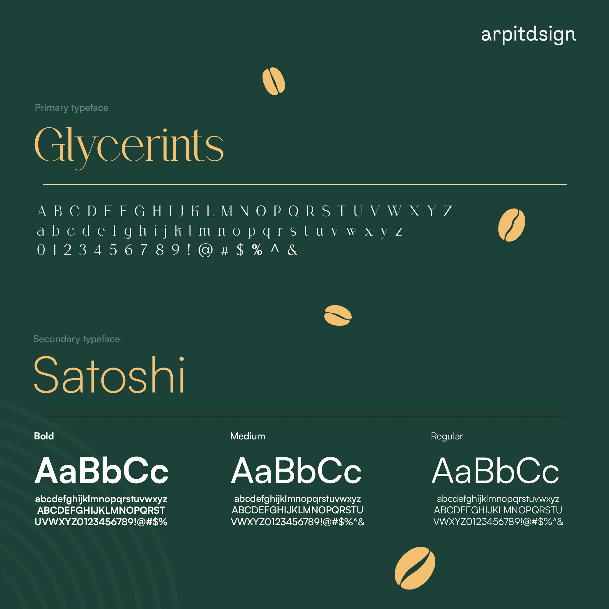
Primary typeface Glycerints serif paired with secondary typeface Satoshi.
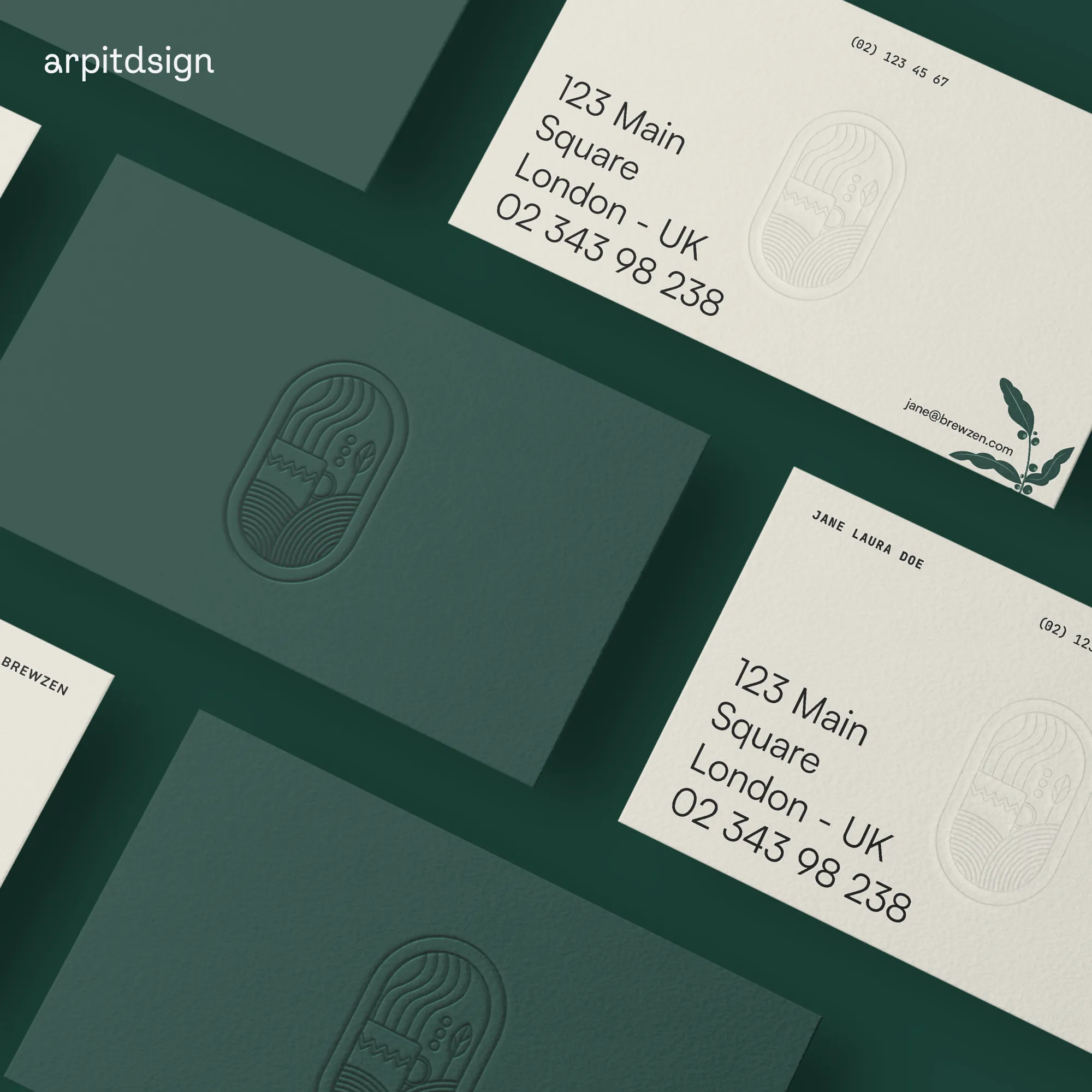
Embossed business cards with tactile forest green and cream paper textures.
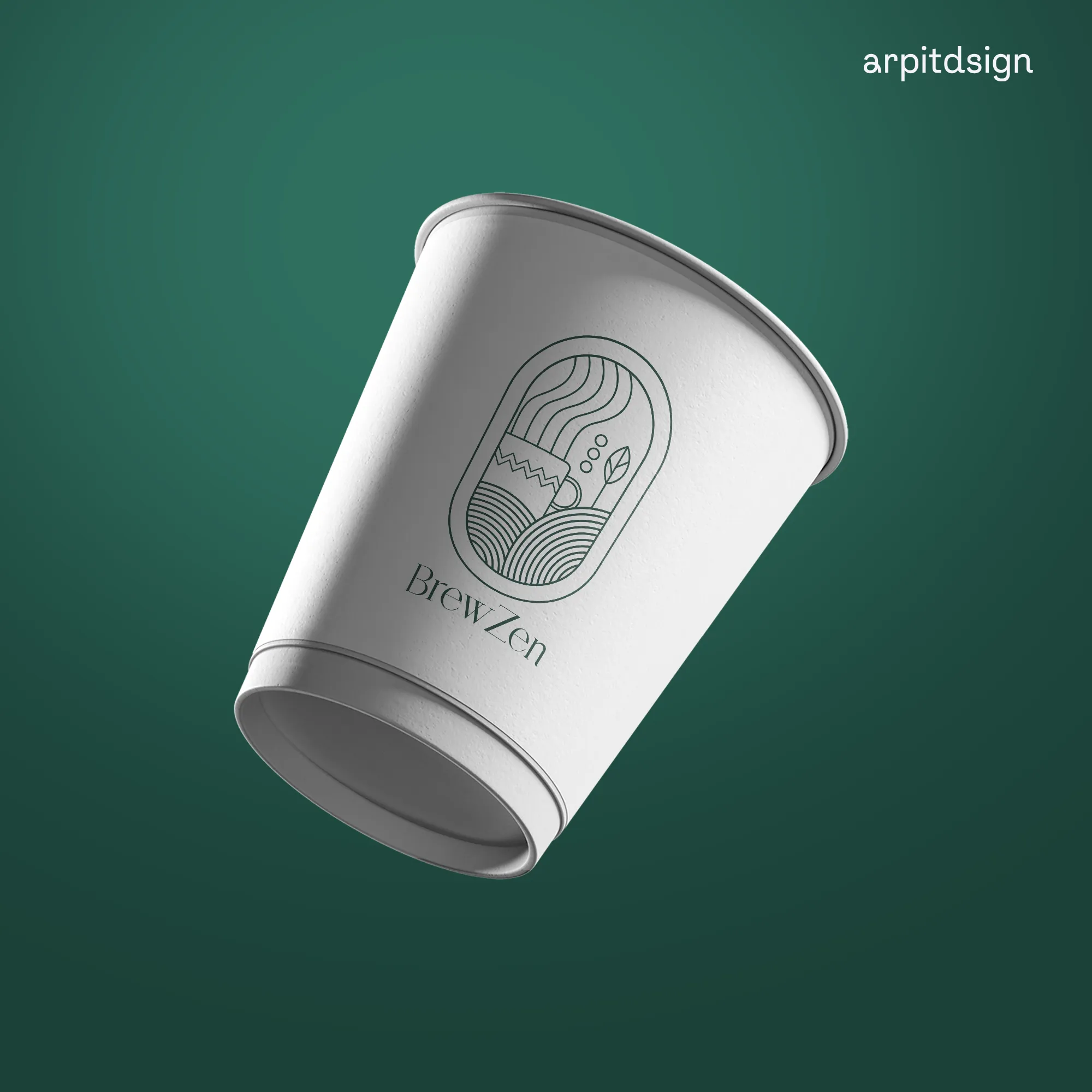
Minimalist brand application on paper cup drinkware.
Tapri
A self-initiated exploration of how everyday Indian roadside tea culture could translate into an authentic digital product and visual system.